Optimal Reality: Creating a new experience for Victoria's road network operators
Type
New user management platform / tool
client
Department of Transport Victoria
role
UX Designer
year
2022
Project Overview
Transport operations controllers for Victoria's road network were struggling to manage traffic and use data efficiently, as they had dispersed systems that didn't communicate with each other and no macro view of the Victorian road network.
Project Outcome
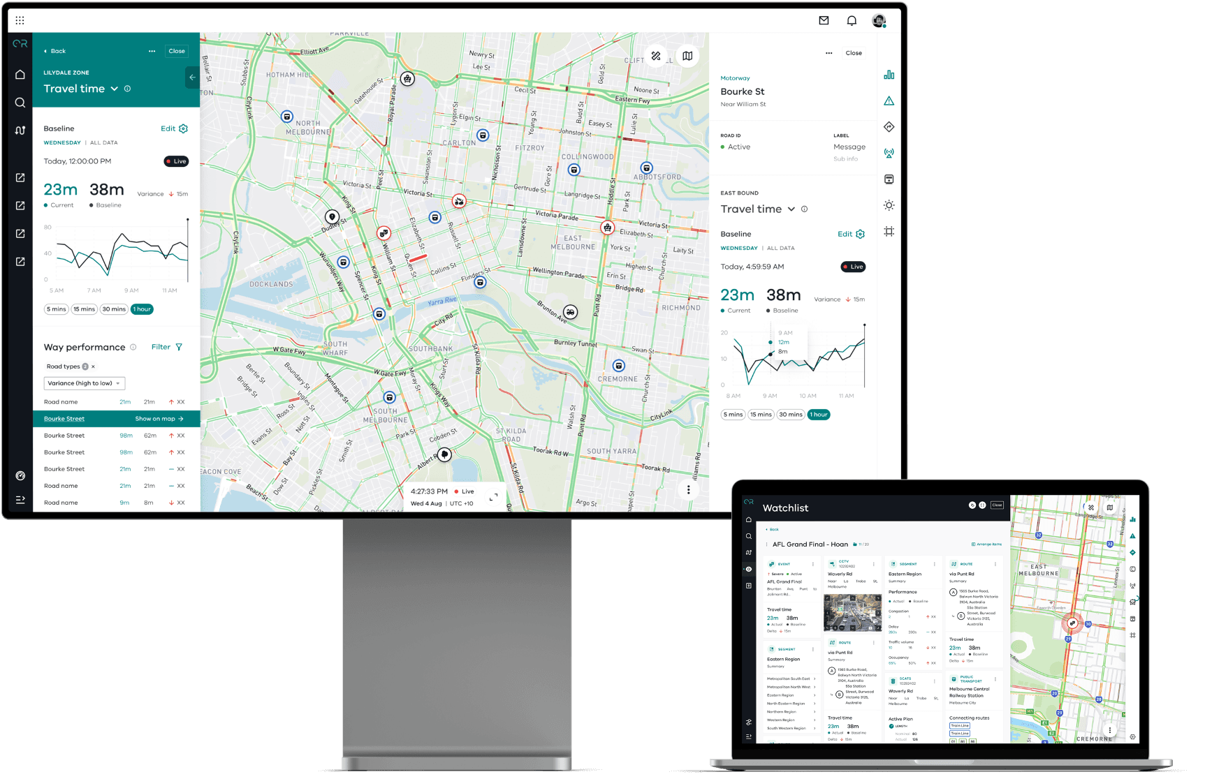
We designed and built a 'Situational Awareness' application for Optimal Reality (Deloitte’s digital twin capability product based on simulation techniques pioneered in Formula One racing), that allows operators to view the entire network in real time and make assessments and changes to make it run as efficiently as possible. This app streamlines multiple business processes and ensures that operators are able to assess the network and the relationship between things such as road performance, devices, events, public transport easily. They can also manage and communicate tasks more efficiently through this tool.
My Role
I worked collaboratively with 4 other designers on this project in agile sprints to design features within the 'Situational Awareness' app of OR. Some of my main responsibilities on this project included:
Working closely with the client to unpack complex requirements and understand business processes
Ownership over the design of large features within the app including the Public Transport (PT) experience and road devices (e.g. traffic signals, cctv cameras).
Documenting designs to communicate to developers how to build and test features, including writing user stories and acceptance criteria.
Working collaboratively in a large team with business analysts, front end and back end developers, data architects and more to support build and enhance designs where required.


Public Transport (PT) design process
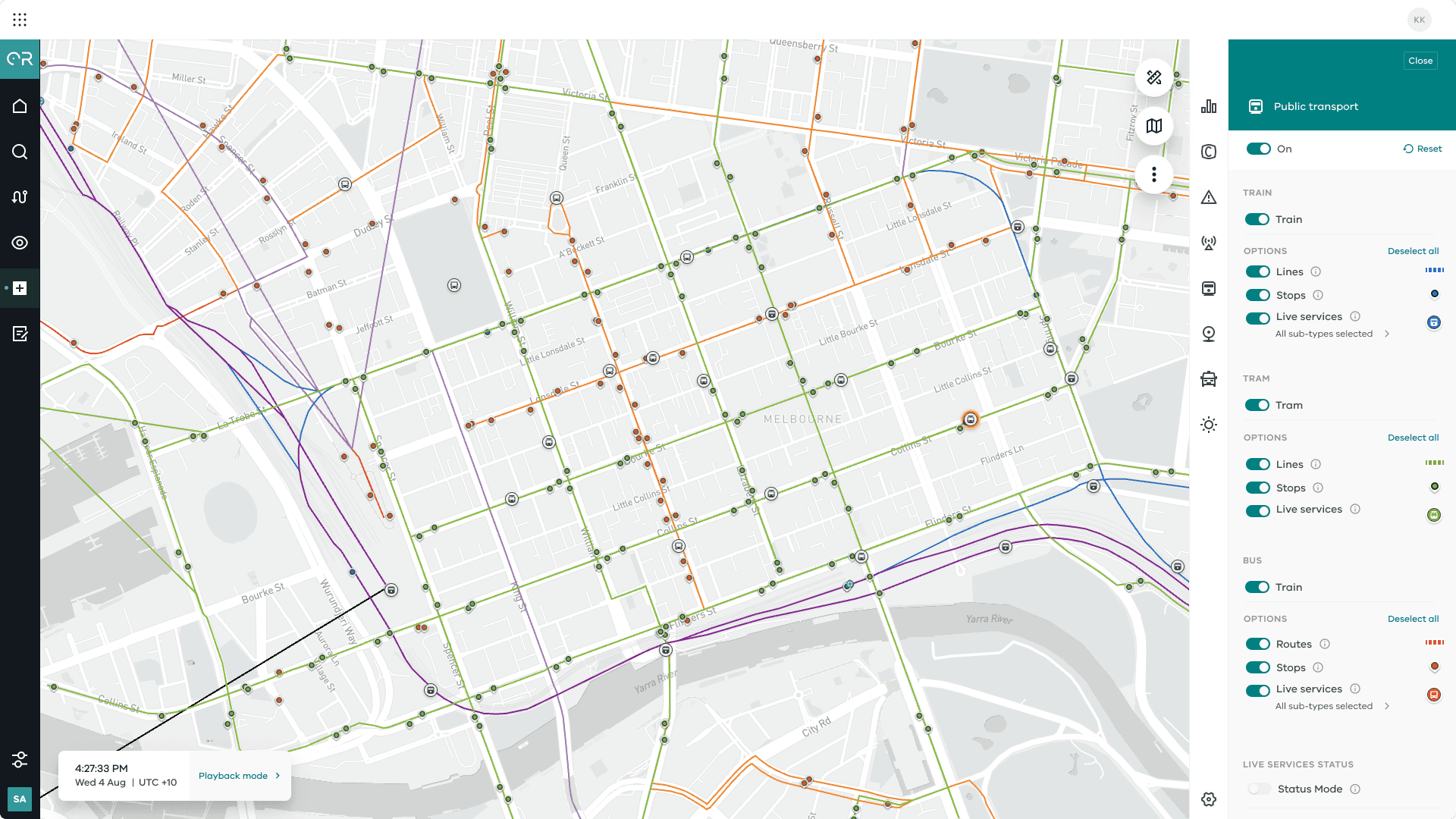
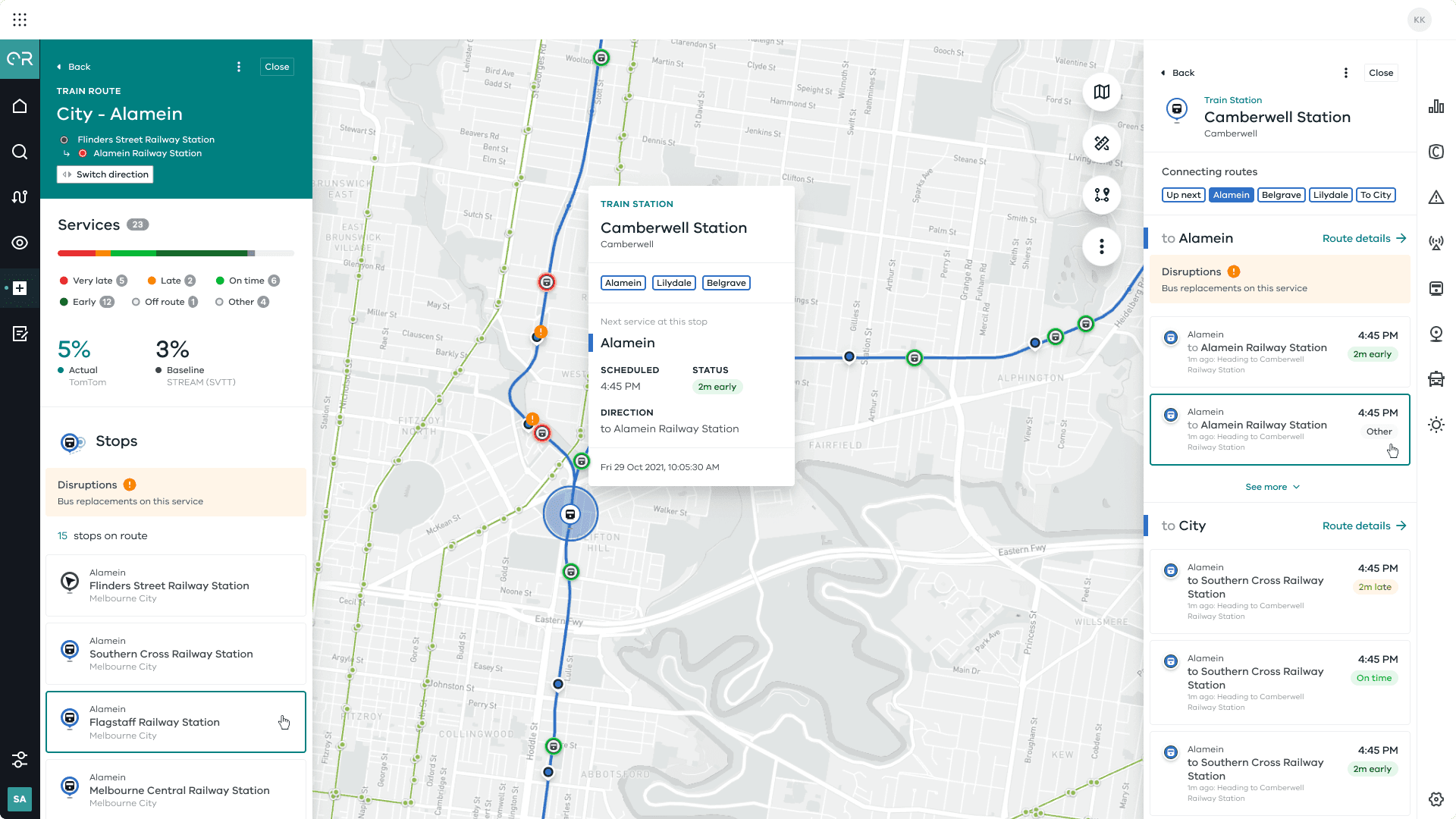
Operators needed the ability to view public transport stops, routes and live services across all modes (trains, trams and buses), so that they are able to assess and manage network impacts stemming from public transport incidents or affecting the running of services.
Designing this feature had three distinct stages:
Stage 1: Discovery
Stage 2: Design
Stage 3: Documentation
DISCOVERY
01. Understand the requirements
To unpack their requirements for the PT feature, I facilitated a discovery session with the client to understand their current business processes and what information was most important for them to help make decisions. Key learnings from the session were that the client used separate applications to track different types of PT modes (e.g. 1 for trams, 1 for trains, multiple for buses), making it difficult to understand how PT modes were performing together. Their focus was also on delayed services in the network, and being able to identify these clearly to prevent further disruptions to the network. Understanding the priority of information they wanted to see also allowed me to prioritise these items in my designs.
02. Landscape & competitor analysis
Before starting on my design of this feature, I drew inspiration from other transport applications. Most of the applications I reviewed only focused on a single mode of transport, which challenged me to think about how features I liked from other applications could be incorporated into my designs.
DESIGN
03. Designing the feature
Data and tech constraints:
I had to work closely with the data team and front end developers to understand what limitations I had to my design. The way the data was set up between routes and trips in the back end caused complexity to the information we were able to show on the front end, and the way in which we were able to let users to interact with certain map assets. To overcome these challenges required frequent check-ins, tech spikes, and iterating on the designs multiple times to ensure that the information was realistic, but also still useful to the end user.
Other design challenges:
There were multiple design challenges when creating the experience for this feature. For example, the colours shown to identify the type of public transport versus colours shown to indicate the status of a service (e.g. early or delayed). It was important for operators to have the ability to see both, so I had to come up with a solution that allowed the user to switch the live service icons on the map between showing mode colours and status colours. I incorporated a switch toggle in the map layer controls to allow the user to change the colours and also filter out services based on type of public transport, as well as status level (early, on time, late, very late). This gave users ultimate flexibility in determining what was visible on their map, so that they could filter to see what was most important to them.
Another challenge was designing within the already built components in the design system. The complexity of the public transport feature required me to re-think and alter established design patterns to ensure the best user experience. Forcing information to be presented in a template that was used for other features did not work for the type of information we needed to show for PT, but I still had to ensure the overall look and feel was cohesive with the rest of the system.
DOCUMENT
04. Document the designs & support developers through build
Along with designing the feature, I was also responsible for documenting the public transport designs, which included writing business rules and user stories to communicate to developers how the designs should function. Documenting business rules and user stories allowed me to clearly define and articulate the expected user experience and helped me consider edge case scenarios that my designs had to cater for. I was also able improve my communication skills working with different developers, supporting them to understand intended functionality.
